Back to PortfollyMeBack

Demo portfolio — content is illustrative. Yours is built from your real work.

Create yours free
Sarah Chen.
WorkServicesReviewsAboutProcessWork with me
Product Designer · SaaS & E-commerce

Design that pays for itself.

I redesign products and pages so more visitors become customers. Below: six projects, the problems behind them, and exactly what they returned.

See my work →Work with me
$0
Revenue added for one client in 6 months
0
Best conversion-rate lift
0
Support tickets cut by one redesign
0
Team hours saved monthly by my design system
Selected work

I'd rather show you than tell you.

Each case below tells the full story: the problem, what I did, and the result.

★ Case study 01 · E-commerce

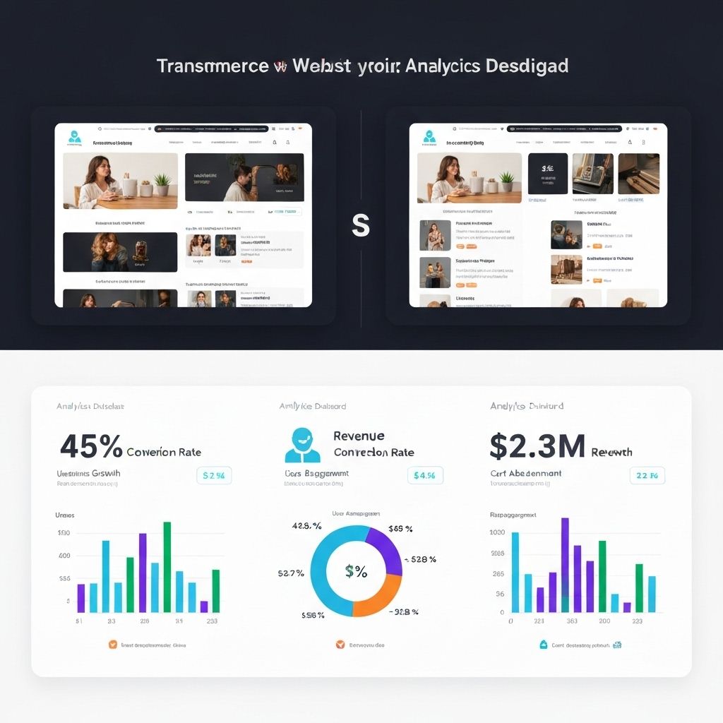
E-commerce Redesign: $2.3M Revenue Increase

Turned a struggling online store into a conversion machine. Complete redesign that increased revenue by 340% in 6 months.

The receipts

E-commerce Redesign: $2.3M Revenue Increase

How it went down

01 The Challenge
  • The fashion brand was getting 50K monthly visitors but only converting 0.8%.
  • Their bounce rate was 72%.
  • The site looked outdated, navigation was confusing, and the checkout process had 7 steps.
  • They were losing $200K monthly in potential sales.
02 The Strategy
  • I redesigned the entire user journey.
  • Simplified navigation to 4 main categories.
  • Reduced checkout to 2 steps with guest checkout option.
  • Added high-quality product photography with zoom functionality.
03 The Result
  • Conversion rate jumped from 0.8% to 3.2% (400% increase).
  • Revenue increased from $680K to $2.3M in 6 months.
  • Bounce rate dropped to 34%.
  • Mobile conversions increased 520%.

Design isn't decoration. It's a revenue driver. Every pixel should have a purpose.

★ Case study 02 · SaaS

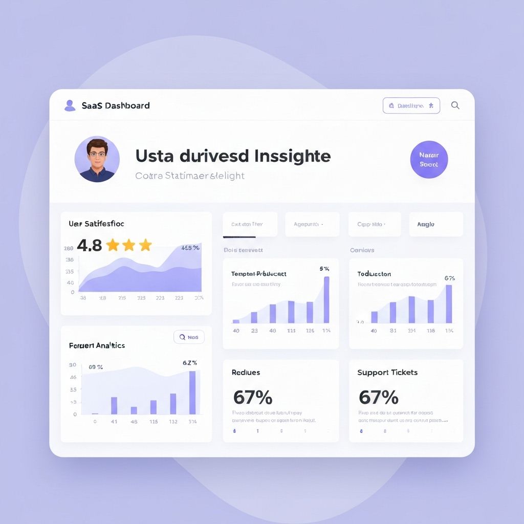
SaaS Dashboard: 67% Reduction in Support Tickets

Made a complex product feel simple. Redesigned a confusing interface into an intuitive experience users loved.

The receipts

SaaS Dashboard: 67% Reduction in Support Tickets

How it went down

01 The Challenge
  • The project management tool had powerful features but users couldn't find them.
  • Support was getting 400+ tickets weekly asking 'how do I...'.
  • User satisfaction was 2.9/5.
  • Churn rate was 34% monthly.
02 The Strategy
  • I conducted 40 user interviews to understand pain points.
  • Redesigned the information architecture completely.
  • Created a progressive disclosure system - show simple options first, advanced features on demand.
  • Added contextual tooltips and empty states with clear next steps.
03 The Result
  • Support tickets dropped 67% to 132 weekly.
  • User satisfaction jumped to 4.7/5.
  • Churn rate decreased to 8%.
  • Onboarding completion rate went from 23% to 81%.

Complexity is easy. Simplicity takes work. But simplicity is what users pay for.

★ Case study 03 · Mobile Design

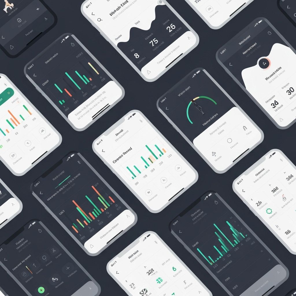
Mobile App: 4.2 to 4.8 Star Rating in 60 Days

Transformed a frustrating app into users' favorite tool. Complete UI overhaul that turned critics into advocates.

The receipts

Mobile App: 4.2 to 4.8 Star Rating in 60 Days

How it went down

01 The Challenge
  • The fitness app had great features but terrible reviews.
  • Users complained it was 'too complicated' and 'ugly'.
  • App store rating was 4.2 with reviews like 'great idea, terrible execution'.
  • Daily active users were declining 5% monthly.
02 The Strategy
  • I redesigned the entire mobile experience with a focus on speed and clarity.
  • Created a card-based interface for easy scanning.
  • Implemented gesture controls for common actions.
  • Redesigned the workout flow to be one-handed friendly.
03 The Result
  • App store rating increased from 4.2 to 4.8 stars.
  • Reviews went from 60% negative to 89% positive.
  • Daily active users increased 43%.
  • Session time went up 67% (users were actually enjoying it).

Mobile design isn't just shrinking desktop. It's rethinking the entire experience for thumbs and glances.

★ Case study 04 · Landing Page

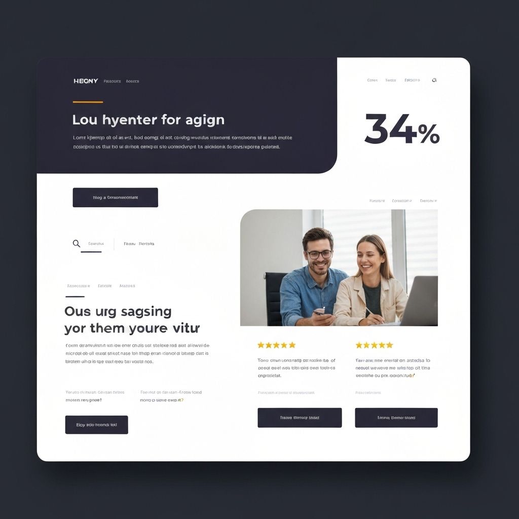
Landing Page: 12% to 34% Conversion Rate

Redesigned a landing page that tripled signups. A/B tested redesign that became the company's best-performing page.

The receipts

Landing Page: 12% to 34% Conversion Rate

How it went down

01 The Challenge
  • The SaaS company was spending $50K monthly on ads but only converting 12% of visitors.
  • The landing page had too much text, unclear value proposition, and weak CTAs.
  • Visitors were leaving confused about what the product actually did.
02 The Strategy
  • I redesigned with a single focus: make the value crystal clear in 3 seconds.
  • Created a bold headline that stated the benefit directly.
  • Added a demo video above the fold.
  • Simplified the page to 4 sections: problem, solution, proof, CTA.
03 The Result
  • Conversion rate jumped from 12% to 34% (283% increase).
  • With the same ad spend, they went from 600 to 1,700 signups monthly.
  • Revenue increased $180K monthly.
  • The page became their template for all future campaigns.

Clarity beats creativity. If visitors don't understand your value in seconds, you've already lost.

★ Case study 05 · Design System

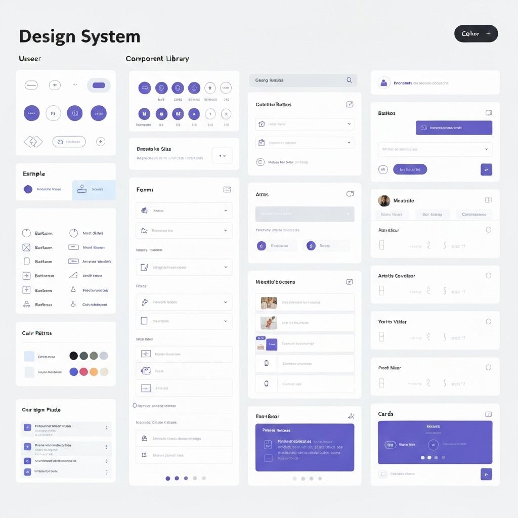
Design System: Saved 200+ Hours Monthly

Built a design system that made the team 10x faster. Created a scalable system that unified the product and accelerated development.

The receipts

Design System: Saved 200+ Hours Monthly

How it went down

01 The Challenge
  • The product had 15 different button styles, 8 shades of blue, and inconsistent spacing everywhere.
  • Designers were recreating components from scratch.
  • Developers were asking 'which blue?' daily.
  • Design-to-development handoff took 2 weeks per feature.
02 The Strategy
  • I built a comprehensive design system from the ground up.
  • Created a component library in Figma with every UI element.
  • Documented usage guidelines, accessibility standards, and code snippets.
  • Worked with developers to implement it in React.
03 The Result
  • Design-to-development time dropped from 2 weeks to 3 days.
  • Team shipped features 73% faster.
  • Consistency across the product went from 40% to 98%.
  • Designers saved 200+ hours monthly not recreating components.

A design system isn't just components. It's a shared language that makes teams move faster.

★ Case study 06 · Branding

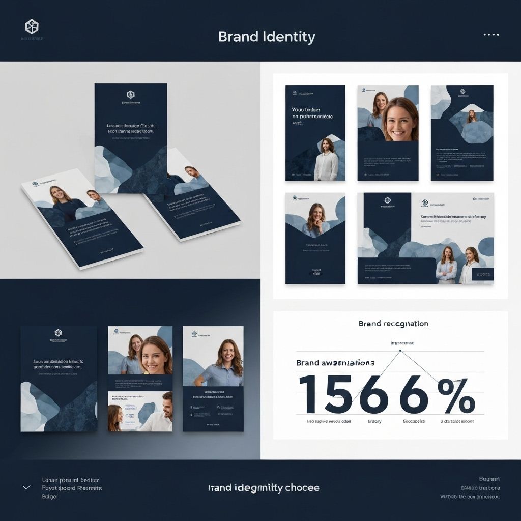
Rebrand: 156% Increase in Brand Recognition

Transformed a forgettable brand into one people remembered. Complete visual identity redesign that made the company stand out.

The receipts

Rebrand: 156% Increase in Brand Recognition

How it went down

01 The Challenge
  • The B2B software company looked like every other tech startup.
  • Generic blue logo, stock photos, forgettable design.
  • In user testing, people confused them with 3 different competitors.
  • Brand recognition was 12% in their target market.
02 The Strategy
  • I created a bold, distinctive visual identity.
  • Chose an unexpected color palette (warm orange and deep purple instead of tech blue).
  • Designed a memorable logo with a unique icon.
  • Created custom illustrations instead of stock photos.
03 The Result
  • Brand recognition increased from 12% to 31% in 6 months (156% increase).
  • Website traffic increased 89% from people searching their name.
  • Sales team reported prospects saying 'I remember seeing you guys'.
  • Won 'Best Rebrand' award from industry publication.

Branding isn't just looking good. It's being memorable in a sea of sameness.

How I can help

Ways to work together.

What I can take off your plate as a Product Designer.

01Start here

Product redesign

Your product, redesigned around what users actually do.

  • User research & interviews
  • Full UI/UX redesign in Figma
  • Dev-ready handoff with specs
If this is youProducts with traction but poor conversion or retention.
02

Conversion audit

Find exactly where your funnel leaks — and how to fix it.

  • Heuristic + data review
  • Prioritized fix list
  • Quick wins you can ship this week
If this is youTeams spending on ads that aren't converting.
03

Design system

A shared language that makes your team ship faster.

  • Component library in Figma
  • Usage & accessibility docs
  • Team training included
If this is youProducts that feel inconsistent and slow to build.
What people say

Don't take my word for it.

★★★★★

“Sarah's redesign paid for itself in 11 days. Conversion is up 4x and the site finally feels like our brand.”

ERElena Ruiz
CEO, fashion e-commerce
★★★★★

“Support tickets dropped by two-thirds after her redesign. Our investors noticed. Best money we spent that year.”

DODavid Okafor
Founder, SaaS startup
★★★★★

“She doesn't just make things pretty — she asks about revenue first. Rare in a designer.”

MTMia Tanaka
VP Product, fintech
My story

A little about me.

Sarah Chen
6
projects shipped

I'm Sarah — a product designer who treats every pixel as a business decision. In 8 years I've turned confusing products into ones people love (and pay for).

How I work

Simple. Fast. Sharp.

01

Tell me the problem

We start with a short call or message about what you need and when you need it.

02

I do the work

You get progress updates as I go — no chasing, no surprises.

03

You get results

Delivered, revised until you're happy, and documented so it keeps working.

Let's talk

Ready to get started?

Tell me what you're working on and where it's stuck. I'll get back to you with how to move it forward.

✉ Email me →
© 2026 Sarah Chen · Product Designer · Built with PortfollyMe↑